THE TRANSFORMATION

Designed a modern wealth platform that builds trust before the first conversation.

Nichols Wealth needed more than a polished website. We restructured the experience to communicate credibility, simplify complex financial services, and create a clear path from first impression to advisor consultation.

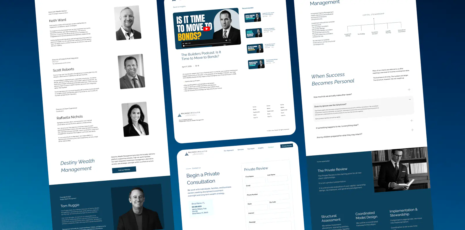
Nicholas Wealth website showing premium advisory layout with warm editorial tones and clear service pathways

Executive overview

Building trust through clarity, structure, and restraint.

Nichols Wealth needed a digital experience that reflected the caliber of the firm behind it. We simplified the information architecture, established a clearer content hierarchy, and introduced a refined visual system that makes complex wealth management services easier to understand while reinforcing credibility at every touchpoint.

Brand foundation

Design System & Brand Foundation

Every transformation begins with a visual system. Before pages are designed or campaigns launch, we establish a scalable foundation that keeps every customer interaction consistent.

Color system

A quiet system for sophisticated advisory trust.

Primary#10415BThe core brand color used for CTAs, navigation, interactive elements, and brand recognition.
Surface#E9F5FBApplied to cards, content sections, and light interface backgrounds to create visual separation.
Background#061A24The primary dark canvas used for hero sections, executive content, and immersive layouts.
Accent#3B657BSupports hierarchy through dividers, icons, hover states, and subtle emphasis without competing with the primary brand color.
Neutral#92ADBBUsed for secondary text, borders, disabled states, and supporting interface elements.
Text / Ink#030D12Provides maximum readability for headlines and long form content on light surfaces.
Typography

Type chosen for clarity, trust, and scale.

Heading typeface · Raleway
ABCDEFGHIJKLMNOPQRSTUVWXYZ
abcdefghijklmnopqrstuvwxyz
0123456789

The heading typeface was selected for calm authority: premium enough for high-net-worth audiences while remaining direct and highly legible.

Body typeface · Barlow
ABCDEFGHIJKLMNOPQRSTUVWXYZ
abcdefghijklmnopqrstuvwxyz
0123456789

The body typeface supports longer advisory explanations without making the experience feel dense or sales-heavy.

Connected data system

Advisory intent is measured beyond page views.

The experience is connected to analytics, attribution, and CRM signals so marketing decisions can be shaped by serious prospect behavior instead of traffic volume alone. The system helps identify which audiences, messages, and consultation paths produce qualified conversations.

Audience quality signals

Service-path engagement, insight reading depth, contact intent, and repeat visits help separate serious advisory prospects from casual traffic.

Source attribution

Campaigns, referrals, organic search, and direct visits are evaluated against downstream consultation behavior.

CRM-connected feedback

Qualified consultations inform future messaging, landing pages, and audience strategy so optimization reflects business fit.

Campaign refinement

Ad spend and creative direction can be shifted toward sources producing higher-trust conversations and stronger client fit.

Mobile-first experience

A mobile experience built for decisive moments.

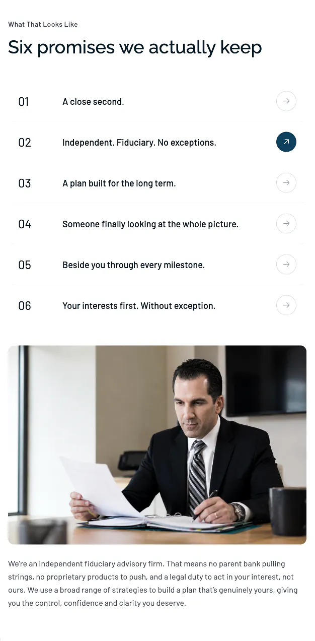
Nicholas Wealth mobile website showing simplified advisory navigation and consultation CTA

Whether reviewing the firm between meetings or researching advisors after hours, users needed an experience that felt immediate and trustworthy. Every interaction was optimized to reduce friction, improve readability, and guide visitors toward meaningful engagement.

  • Mobile first content hierarchy
  • Streamlined navigation
  • Clear consultation pathways
  • Readable typography at every size
  • Fast, distraction free experience
  • Consistent cross device interface

User Experience Decisions

Every design decision supports trust and clarity.

Simplified the client journey

Rather than overwhelming visitors with every service upfront, we organized the experience around how prospective clients naturally evaluate a wealth management firm.

Strengthened advisor credibility

Executive biographies, investment philosophy, and firm expertise were given greater visual hierarchy to establish confidence before the first consultation.

Made complex services easier to understand

Content was restructured into clear, digestible sections that help visitors quickly understand the firm's capabilities without unnecessary complexity or financial jargon.

Built a scalable content system

Flexible page components and reusable layouts allow the firm to publish new insights, advisor content, and future marketing campaigns while maintaining visual consistency.

Design philosophy

Every interface decision was made to communicate professionalism, trust, and long term stewardship. From typography and spacing to navigation and content hierarchy, the experience was designed to reduce friction and help prospective clients make informed decisions with confidence.

Outcome

The result is a modern digital platform that reflects the firm's reputation, simplifies the client journey, and provides a scalable foundation for future growth, marketing initiatives, and ongoing content publishing.

Business challenge

Nichols Wealth needed a digital presence that reflected the sophistication of the firm while making complex financial services easier to understand. The challenge was building trust without relying on generic financial industry design patterns.

Design strategy

We focused on clarity over complexity by simplifying navigation, strengthening content hierarchy, and creating an experience that naturally guides visitors toward understanding the firm's expertise and beginning a conversation.

Creative direction

The visual language combines refined typography, generous whitespace, restrained color, and editorial inspired layouts to create a premium experience that feels confident, timeless, and approachable.

User experience

Every interaction was designed to reduce friction and increase confidence. Clear service pathways, intuitive navigation, and thoughtful content organization help visitors quickly evaluate the firm and take the next step.

Design system

A flexible component library and reusable page structures were created to support future service pages, advisor profiles, market insights, and ongoing marketing initiatives while maintaining visual consistency.

Business impact
  • Stronger first impressions for prospective clients
  • Clearer communication of advisory services
  • More scalable content publishing
  • Improved consultation pathways
  • Consistent brand experience across every page