Color system
THE TRANSFORMATION
From five disconnected offices to one digital experience.
Destiny Wealth was expanding across Florida, but its digital experience wasn’t keeping pace. We designed and developed a unified platform that connected five offices, simplified the client journey, and created a scalable foundation for future marketing and advisor growth.

Executive overview
Destiny Wealth had outgrown its website.
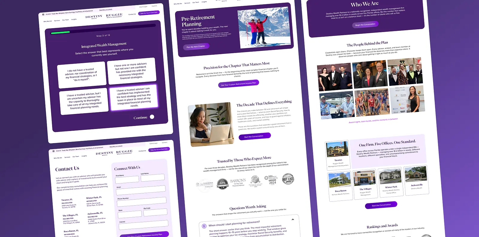
As the firm expanded across multiple Florida offices, years of independent updates had introduced inconsistencies in navigation, messaging, and page structure. Rather than simply modernizing the interface, we approached the project as a systems challenge, designing a scalable digital foundation that could support the firm’s continued growth.
We developed a unified design language, established a consistent content hierarchy, and created reusable components that brought every office and service into one cohesive experience. The result is a platform that strengthens trust, improves usability, and gives the internal team a framework for launching new content and marketing initiatives without rebuilding from scratch.
Brand foundation
Design System & Brand Foundation
Every transformation begins with a visual system. Before pages are designed or campaigns launch, we establish a scalable foundation that keeps every customer interaction consistent.
Typography
Type chosen for clarity, trust, and scale.
abcdefghijklmnopqrstuvwxyz
0123456789
Canela Trial gives the Destiny Wealth experience a refined editorial voice that feels sophisticated and authoritative while remaining highly legible across desktop and mobile.
abcdefghijklmnopqrstuvwxyz
0123456789
Proxima Nova keeps advisory content clear, modern, and easy to scan, giving prospects space to understand the firm before taking action.
Connected data system
Traffic signals become smarter lead generation.
The site is connected to the data systems that show how prospects discover, move through, and take action across the Destiny Wealth experience. Those signals are used to refine campaigns, improve attribution, and focus ad spend on high-quality opportunities instead of vanity traffic.
Page depth, CTA clicks, form starts, advisor interactions, and location interest reveal which journeys create qualified intent.
Traffic source, campaign, keyword, landing page, and conversion path are connected so performance is measured by lead quality.
Qualified consultations and disqualified inquiries inform future targeting, creative, and follow-up strategy.
Ad audiences and budgets are adjusted toward channels and messages producing real conversations, not empty clicks.
High research intent, strong office-page engagement, and advisor profile views signal prospects comparing local expertise.
Conversion paths are evaluated by consultation readiness, not cost-per-click alone, so budget can move toward higher-intent terms.
Returning visitors from partner and professional networks are separated from cold traffic to protect quality reporting.
Form starts, drop-off points, mobile taps, and booked appointments show where the page should be simplified or expanded.
Mobile-first experience
Designed for mobile conversion first.

Most prospective clients will experience the website from a phone first. The mobile system prioritizes large touch targets, simplified navigation, faster page loading, optimized forms, reduced friction, clear calls-to-action, and a shorter content hierarchy that moves visitors toward advisor conversations.
- Large touch targets
- Fast page loading
- Clear calls-to-action
- Simplified navigation
- Optimized forms
- Reduced friction
User experience decisions
Every decision solves a business problem.
Prospects can begin the advisor conversation before navigating deep into the site.
The core journey emphasizes who the firm serves, where offices are located, and how to take the next step.
Office and advisor content becomes easier to scan, compare, and act on.
Future campaigns can launch from the same trusted design system instead of one-off pages.
We don't choose colors, typography, spacing, or layouts based on trends. Every design decision supports trust, usability, conversion, and long-term scalability.
The result was not simply a better-looking website. It became a scalable digital platform capable of supporting future campaigns, new office locations, evolving content, and long-term business growth.
Five disconnected digital experiences created inconsistent user journeys and made future publishing harder than it needed to be.
Unify the offices around one digital architecture while preserving the credibility and trust needed for wealth advisory decisions.
Prioritized clear paths to advisor contact, simplified content hierarchy, and repeatable page modules for future growth campaigns.
Created reusable visual and content patterns so new pages can launch with consistency instead of one-off production.
Mapped the existing web footprint, consolidated content needs, designed the new system, then built a scalable CMS-ready platform.
- One connected brand experience
- Faster publishing across offices
- Improved conversion paths
- Built to scale future campaigns