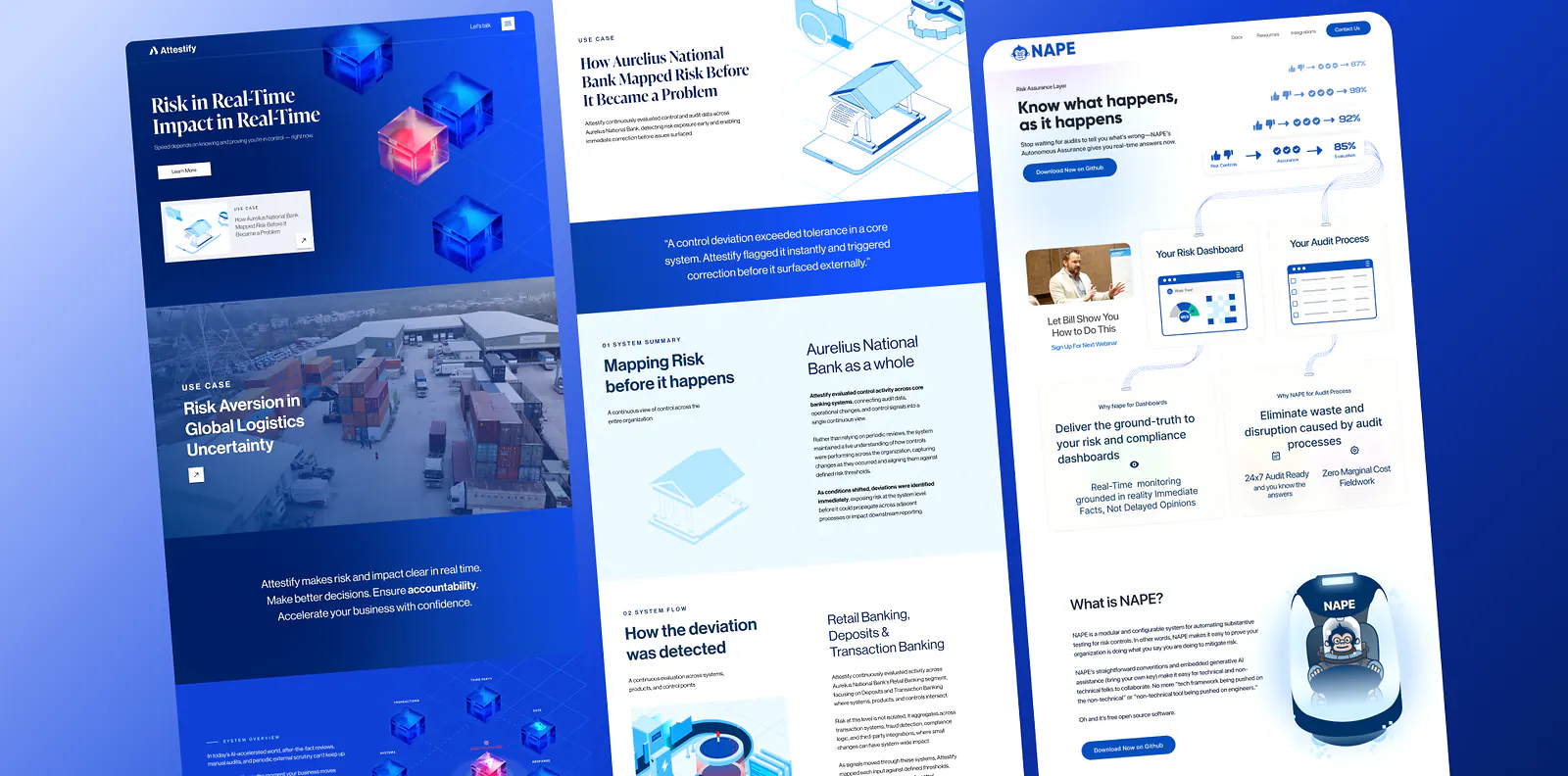
THE TRANSFORMATION

Know what happens, as it happens.

We designed NAPE and Attestify to continuously collect signals across business systems, helping organizations detect issues early, monitor regulatory readiness, and give executives real-time visibility into what requires attention before an audit ever begins.

Attestify enterprise assurance platform showing compliance dashboard with status indicators and executive summary

Assurance report structure

Visual markers make dense assurance work easier to scan.

The Attestify interface uses a native assurance icon system to turn long reports into recognizable sections: summary, exceptions, pipeline, evidence, tests, metadata, and appendix. Icons are functional hierarchy, not decoration.

Executive Summary

Report summary and executive narrative are visually anchored before the user reaches dense evidence.

Report summaryAssurance status, scope, and key observations.
Executive narrativePlain-language interpretation for leadership.
Exceptions Requiring AttentionWarning markers isolate risk and unresolved findings without forcing the user to hunt through the report.
Report DetailsMetadata icons distinguish scope, period, owner, version, and review state.
Assurance Pipeline

Evidence, execution, outcome, and completion states read as one controlled assurance flow.

Evidence

Source files, artifacts, and supporting documentation.

Test execution

Procedure runs, code execution, and validation state.

Outcome

Result quality, exception state, and action requirement.

Procedure completed

Finalized procedure context and audit-ready completion state.

Overview — Activities & Actions

Activity, action, and objective icons separate what happened from what needs to happen next.

ActivityTime-based behavior and review movement.
ActionNext steps, ownership, and workflow movement.
ObjectiveProcedure intent and assurance target.

Evidence, Tests & Appendix

Explorers and supporting references use distinct pictograms so users can move through long reports without losing context.

Evidence fileEvidence Explorer files and artifacts.
Test of detailTest Explorer execution and code context.
ReferenceAppendix material, definitions, and supporting procedure notes.

Executive overview

Complex reporting translated into decision-ready product UX.

The transformation focused on turning dense compliance information into a clear assurance workspace: status, evidence, reporting, and executive interpretation in one coherent interface.

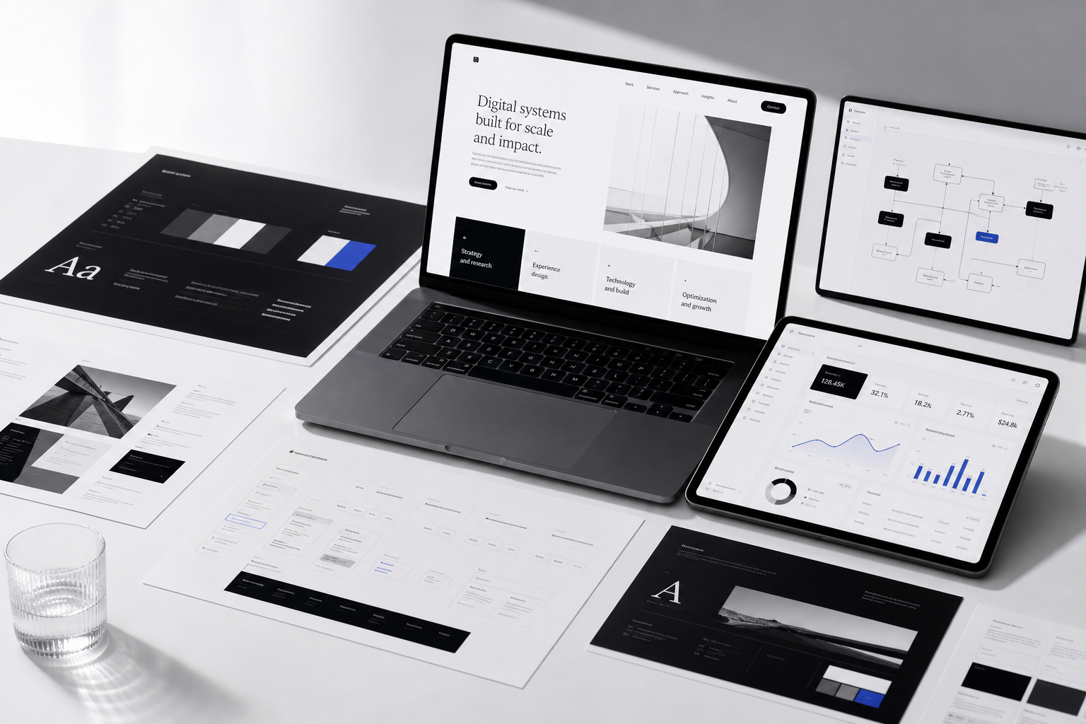
Brand foundation

Design System & Brand Foundation

Every transformation begins with a visual system. Before pages are designed or campaigns launch, we establish a scalable foundation that keeps every customer interaction consistent.

Color system

A product foundation for executive assurance.

Primary#0D1117RGB 13, 17, 23Enterprise workspace, navigation, and executive surfaces.
Surface#F3F6FARGB 243, 246, 250Report surfaces, evidence panels, and content fields.
Accent#2F6FEDRGB 47, 111, 237Status, action, focus, and assurance states.
Background#FFFFFFRGB 255, 255, 255Readable executive summaries and dense information areas.

Typography

Type chosen for clarity, trust, and scale.

Heading typeface · Perfectly Nineties
ABCDEFGHIJKLMNOPQRSTUVWXYZ
abcdefghijklmnopqrstuvwxyz
0123456789

The heading typeface gives executive screens a clear hierarchy without turning the product into a static report.

Body typeface · Denim
ABCDEFGHIJKLMNOPQRSTUVWXYZ
abcdefghijklmnopqrstuvwxyz
0123456789

The body typeface keeps dense compliance language, status notes, and table-adjacent content readable across screen sizes.

Connected data system

Compliance engagement becomes actionable product intelligence.

The platform experience is designed around measurable behavior: what executives review, where teams hesitate, which reports need attention, and which assurance signals create action. Data connections turn a static reporting flow into a system that can improve clarity over time.

Interaction signals

Dashboard views, evidence expansion, report exports, and status checks show which assurance moments matter most.

Workflow attribution

Actions are connected to role, report type, risk state, and review path so product decisions reflect actual usage.

Operational feedback

Repeated friction points inform interface changes, content hierarchy, and automation opportunities.

Quality optimization

The system prioritizes meaningful engagement with executive-ready insights instead of passive report consumption.

Mobile-first experience

Designed for quick assurance status checks.

Attestify mobile assurance interface showing status indicators and executive summary view

Mobile views prioritize status, risk signals, and next actions over dense tables. Large touch targets, simplified navigation, collapsed evidence areas, and concise summaries help stakeholders understand what needs attention fast.

  • Large touch targets
  • Fast page loading
  • Clear calls-to-action
  • Simplified navigation
  • Optimized forms
  • Reduced friction

User experience decisions

Every decision solves a business problem.

Elevated status first

Executives see what changed and what needs attention before reading supporting evidence.

Reduced report friction

Long reporting rows become modular product screens with clearer hierarchy.

Introduced reusable detail panes

Evidence stays accessible without overwhelming the primary workspace.

Clarified action ownership

Review, export, and attention states are visible in the interface.

Design philosophy

We don't choose colors, typography, spacing, or layouts based on trends. Every design decision supports trust, usability, conversion, and long-term scalability.

Outcome

The result was more than a cleaner dashboard. It became an application foundation that helps teams interpret assurance data, act faster, and scale future compliance modules with consistency.

Business challenge

Compliance reporting can become dense, slow, and difficult for executives to interpret without context.

Strategy

Reframe the experience around decision clarity: what matters, what changed, what needs attention, and where evidence lives.

Creative direction

Use a product-grade enterprise aesthetic with restrained density, clear hierarchy, and fewer report-like surfaces.

UX/UI decisions

Elevated assurance status, comparison, evidence, and workflow signals into visible modules instead of buried reporting rows.

Design system

Built reusable application patterns for cards, tables, status modules, detail panes, and executive summaries.

Outcomes
  • Clearer executive interpretation
  • More application-like assurance workflow
  • Reduced report-viewer friction
  • Reusable interface system for future modules